I want to share some progress on my work with the Space Weather Modeling Framework. To get you on board again, I try to simulate a solar magnetic shield for Mars. It is best explained in the blog article On Project Nahual. Somewhere later in time, I got prominent support and discovered the Space Weather Modeling Framework (SWMF). For that, see On plans.
In the meantime, I got a lot more comfortable with the usage of the SWMF. I use the software to simulate planetary magnetic fields (like Earths magnetic field) and their interaction with solar wind. This way, I get a better understanding about how these magnetic fields behave and what influences them. But to get away from this most theoretical level (and stay on a still very theoretical level), I first want to share, how this work actually looks.
The SWMF is capable of many things and it has a specific module called “global magnetosphere”, which is exactly what I need and use. After an installation in a Linux distribution inside Windows, I can start a modelling run by providing a parameter file and giving a start command. This is now quite comfortable. However, it took me quite a while to get the inputs to the parameter file reliably working. I added a video to show the workflow.
My currently latest advancement is the modeling of two separate magnetic fields, the Earths and an arbitrary second object. In later stages, this would be the Mars without a magnetic field and a small object with magnetic field of not yet known specifications.
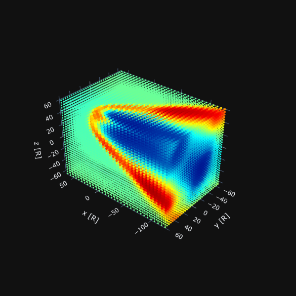
With this “#SECONDBODY”-feature learned, I started to look at some simulations closer to my use case. While I could just change to Mars as a chosen first object, it would not interact with the solar wind on a planetary scale, so it does not give me additional information (and looks less interesting). The second interesting change for my use case is the actual distance of things. The “global magnetosphere” model uses the planet radius as distance unit. I understood this only pretty recently as I tried to get the distance of things right. While it may seem counterintuitive to have a distance measurement and a grid which is completely different for each planet, it saves computational resources to normalize everything to this. At least that is how I understood the design choice explanation.
This also means, a grid, which is from -60 to 60 [R], actually spreads over 120 Earth radii with only 20-something dots (depends on the refinement parameters). So there easily fits an Earth or two between each of the simulation dots. The Earth has a mean radius of 6.137 km. It is possible to get better resolution, but of course, this costs computing power and I need to learn, how the refinement parameters work. To achieve the distance of Mars and its L1 Lagrange point, I would need to place the second object at around 140 Earth radii. I tried this, but I got several problems, with the size and uniformity of the grid as well as even this level of refinement. This is nothing, which cannot be solved by some tinkering with the parameters, however to get something working for this milestone, I settled for 80 Earth radii distance, because I got it to work way easier. For Earth, this is a distance of around 500000 km. For reference, the moon is at 384400 km and the ISS is at around 420 km. Actually calculating the distances always gives me a feeling for the actual size of even our closest neighborhood.
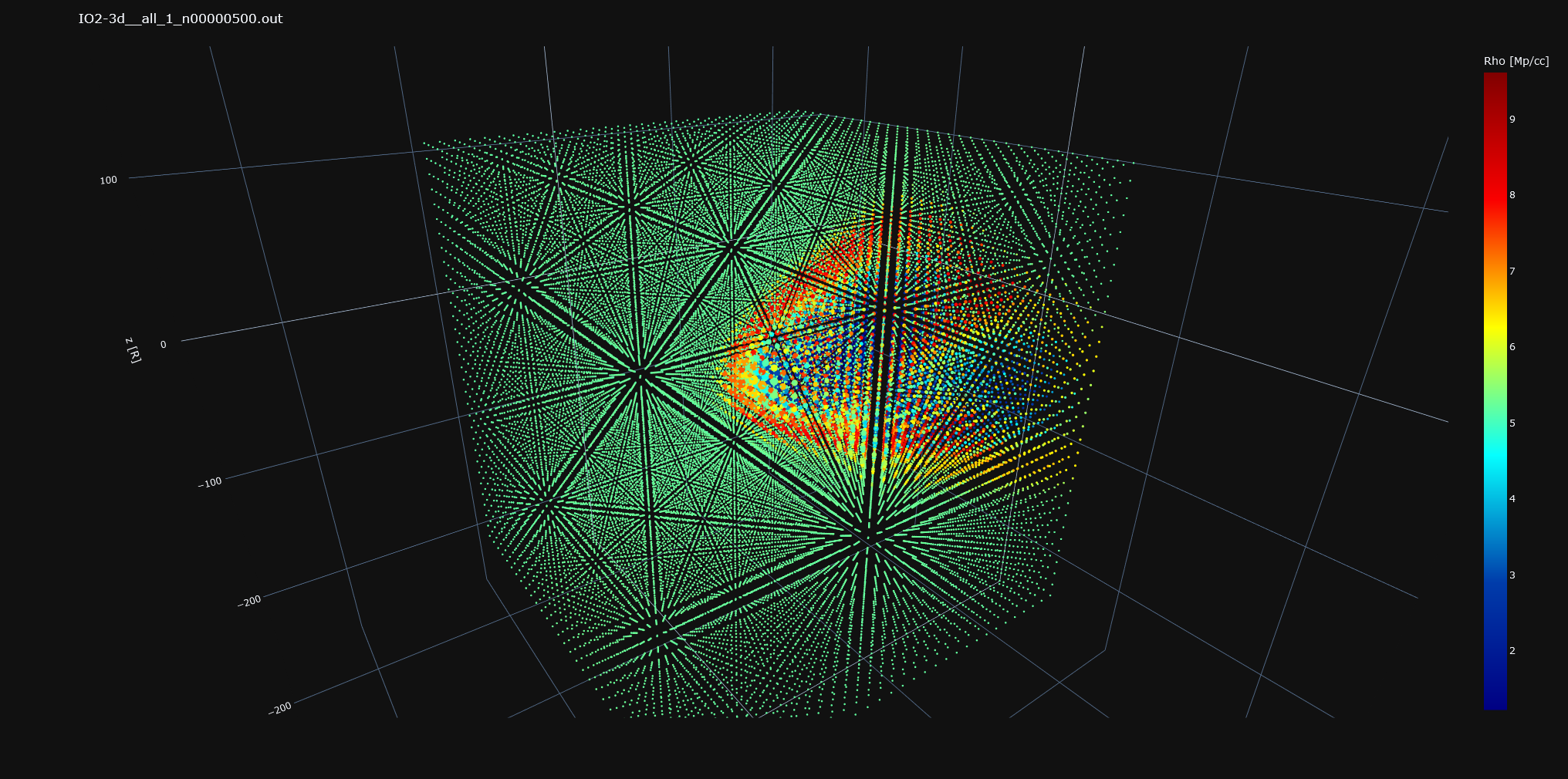
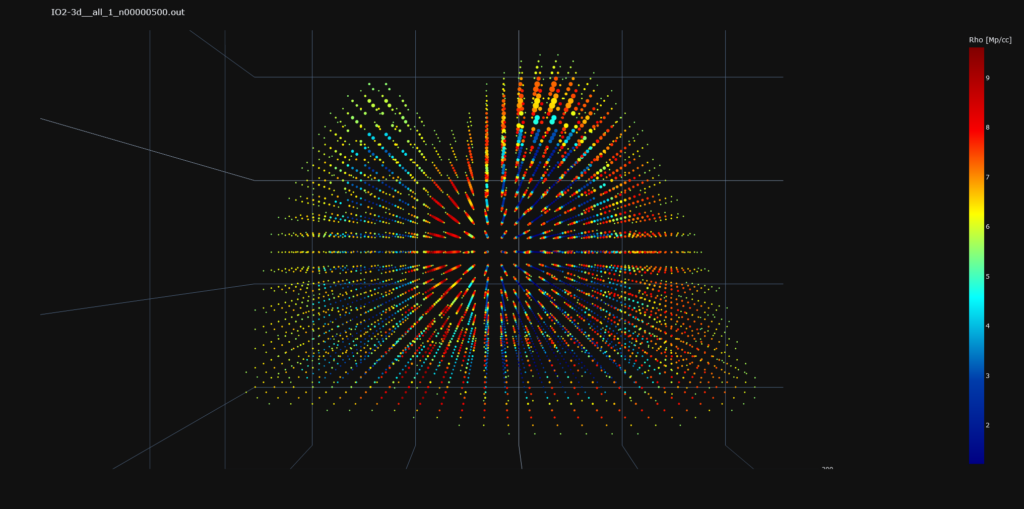
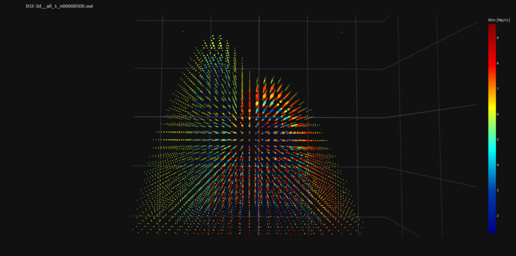
Another target or idea for this milestone was to improve the images by reducing less useful data. It obstructs the view and the python imaging library Plotly also has some soft limitations on how many dots it can produce. When working with the WSA-ENLIL model, the size of the less interesting dots conveniently was small enough, however for the SWMF and my parameters, this is not the case. Additionally, the most interesting dots are the ones with very high or very low values. As a cheap solution, I just not printed dots with the median density +- 5%.
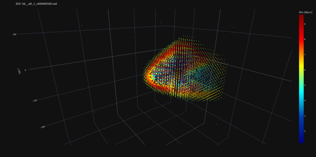
While a 2D representation might be more useful or clearer for a website, I am very happy for the 3D images, as they allow for a better understanding of the data and a more direct way to spot errors, as explained in my first blog post On graphing the stars.
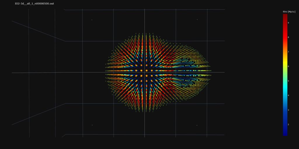
Now for a last learning with this feature, I wanted to move the second body between Sun and Earth. See the following top-view images.
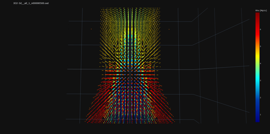
With moving the second body from the Y axis to the X Axis in Front of the Earth, I get this simulation artifact, where no bow shock can be found for the second body in front of the Earth. I suspect, the “perturbation” of the magnetic field are too close to the connection to the ambient medium, which feeds the “global magnetosphere” model. I experienced a similar issue, when I moved the X-axis simulation border too close to the Earth at an earlier testing. I suspect to solve or work around this problem and increase my simulation size and resolution, but for the moment I am quite happy, to get a reliable output and gaining a lot of knowledge about the SWMF as well as space weather itself.
I currently plan to do a bit of paper reading to feed my learnings of space weather with technical Know-how. But plans change as the weather does. And in the meantime, life happens to be complicated. Beautiful and complicated. See you around.
All pictures and content to download: On-how-the-work-actually-looks.zip
Direct link to post and comments: https://nahual.eu/on-how-the-work-actually-looks/